feat: add cpp folder icons#3306
Conversation
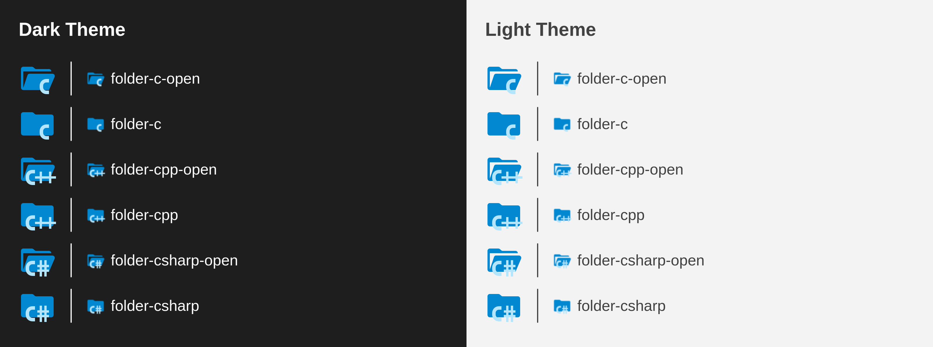
PreviewThank you for creating a pull request. This preview shows you how your icons will look on the different themes: Check how your icons fit in a 16x16 grid with our Pixel Perfect Checker by following this link. You can find more information on how to contribute in the contribution guidelines. |
762de65 to
205fba9
Compare
There was a problem hiding this comment.
Thanks for the contribution. I've reviewed the icons, and I've the feeling that the motifs are still a little bit small compared to our other folder icons. So maybe we can adjust the design here a little bit so that it fits better.
Additionally, the c++ icon looks different on the file and for the folders:

Usually, we try to have some consistent styling here.
There was a problem hiding this comment.
I definitely agree with what you're saying about the C++ folder, and personally I think the C# folder is worse at adhering to the file icon design.
The problem I was running into is trying to align the ++ to the middle of the C while keeping it aligned to the grid, but I found a compromise. I aligned the ++ to the grid and to the middle of the C, but increased the C by 1 pixel (now exactly half of the scale of the file icon).
This puts the C slightly off of the grid, but to my eye it doesn't add any blur at 16x16. Please let me know what you think and I will update the C and C# folders to align with this design as well if it works
There was a problem hiding this comment.
I updated the C and C# folder icons and I think they look better now.
The C glyph looks ever so slightly blurrier, but I don't think it's too bad at this scale:

The folder icons still don't look exactly the same as the file icons, but I couldn't find anything that looked better at that scale.
This is using the same icon for the file just scaled down by 0.5x:
![]()
And here at full scale, obviously way too big:
![]()
The problem is the ++ in the file icon is 1px wide and can't be scaled down any without losing clarity. Hopefully these icons work, let me know what you think.
There was a problem hiding this comment.
Sorry for the late response, I'm little bit busy at the moment. I need to spend some time to play around with your suggestions, I'm not sure if we can merge it like that. But it's on my list and I'll come back to it when there's little more time. Keep your PR open for now, it has potential.
There was a problem hiding this comment.
- the icon does not work i mean the icon for the "cpp" folder

There was a problem hiding this comment.
@ProgramerXYZ This PR is still open and not merged yet.
|
Are these ok? 


@PKief should i have to move these ones by one pixel up too? |
|
@SayanShankhari yes following the existing pattern would be better, moving one pixel up will be better. However, I don't like the icon proposals yet, The plus icons don't look nice right now |
|
well, do you have any recommendation for the double plus? 
Or would you prefer Cpp instead of C++ Or, how about this, although the two pluses (3x3) reduces to dots in smol preview. 


|
|
idk, it looks good to me, but i'd suggest to change the original icon colors 
|
Description
Added a folder icon for C and C++
Fixes #3087
Contribution Guidelines